Friday, December 16, 2016

Lab 8 Editing Tools

Hello everyone!
For lab 8 our main objective was to use editing tools on picture. And we had to improve the pictures. This lab was really fun and it's important. By doing this lab I learned a lot about tools and photos. Its cool that I learned how to use new tools but I also learned what to edit on pictures or what to take out from pictures or add. I also learned what are the important of paying close attention small details. And I was amazed what these tools can do and their effect. This is a really important lab for our future. Now we can make old people young and make pictures much better then before so if we get hired to edit pictures this is important. Because these are the effects that can make a bad picture neat and clean.  In future I will be editing picture there are the tools that you must know to edit a picture.

So for this lab we had 4 different picture and we had to make up the last picture. So for the first picture we had to get rid of Gray part that was in the picture and few unnecessary spots on the picture. the final effect came out really cool. so for the first image i used Clone stamp tool and healing brush tool. so the first picture was  like this... and came out like this... if you can see the grey part is gone and two of the dots are gone from the picture. And the picture is smooth So to use the healing brush tool you click alt and you select a specific area and it will copy the source from their and you can cover up the spot that you want to remove. And for clone tool its similar but if you use it more and more from the same source it will make a pattern making the picture not smooth. so i took sources from different place. That was it for the first picture.

For the second picture we had to get rid of bullet holes and graffiti from the picture. so we had to use the patch tool. So you would circle and area that you want to remove and after circling drag that part to a piece of rock that matches in similar color. I use a nearby area. That's it you are done after you covered all the bullet holes and graffiti. here's the picture.

For the third picture We have a window and some flowers. Our objective was to make one side look old and soggy and other side look nice and bright. Also we had to change the color of the top wall and smudge the tiles under. first i replace the color of the wall. Next i use the burn tool to darken the window on left side. Next I use the blur tool on the window cover so it would look soggy and wet. Last, for left side i use the sponge tool to Desaturate the flowers and the tree so it looks like the tree is dying. That's it for the left side for the right side, I tad to use the dodge tool to brighten the window. Nest i use the sharpen took in the window cover to it would look nice and clean. After that i had to use the sponge tool to saturate the flowers so the flowers would look bright and nice. At last i used the smudge tool in tiles.

For the fourth picture we would have to make an old men young. Like we would have to remove his winkles from face. and brighten the face so he looks young. For this you can use all the tools that you were suppose to use on this lab. I used the healing brush tool, and dodge tool and my picture came out nice and the guy on the picture have no wrinkle and looks young. If you want you can use other tools but i didn't use other tool.


(Note im not finished! ill add the next pictures soon and explain how to do them.

Sunday, December 4, 2016

Lab 7 Filters.

Hello everyone!
Lab 7 was one of the best and fun lab to do. It was really easy and fun. You get to pick effects that you wanted and use it on your friends picture or a close up. It was hilarious. I really enjoyed this project. This project looked complicated but it was not. All we did was use different image effects. And Its really cool how this software can do so much in seconds. I loved how my effects came out and it was cool to know that you can put effects of actual things like you can liquefy the picture or make it in to like a poster.

For this lab I use The following effects: Glowing edge, Liquefy, Poster edge, Plastic wrapper, oil painting, Mosaic tile. This was really cool and very important. Visual design is all about different effects to make a picture cooler or improve a picture. Until now I didn't know that you can do this type of effect on picture. In future if we have out own choice to put effects on a picture i will use some of there effects. my picture came out like this.

Lab 6 Vector shape tool

Hello!
Our lab 6 was about vector shape tool and we had to use different tools to improve our landscape. I didn't like this lab. Because vector shape tools aren't for my  painting. They had shapes of many things but not the ones that i needed. My work was for more of brush tool then vector shape tool. My painting came out like this. And my vector shape tool was nothing like that. It was  really bad. I don't know what was i doing wrong. My vector shape came out like this....

And my painting came out like this....
I liked the painting better because it was more effective for me. And the painting came out smooth for me because i had different brush to color different part of the picture. And for vector shape i didn't had the type of leaf that i wanted so i had to use the cloud tool to make my leafs and the water didn't
came out nice. I also couldn't color the sand smoothly. I don't like vector shape tool ill have to improve my vector shape tool. I put my best effort in vector shape but it didn't come out nice at all.

This lab is important because in future we will be working with different shapes and there are a lot of tools that is useful they had all the common tools. And there are a lot and its like more than hundred tools. Its hard to draw sometimes so they have the tools like animals and flowers. I saw my friends vector shape it came out really beautiful, better then painting and the original. The cool thing is you get to pick your color when you are using the tools. 

Tuesday, November 22, 2016

Lab 5 brush tools.

Hello everyone!
In lab 5 we had to use different types of brush tool and colors to complete the landscape that we sketched. It was really fun. We had a whole bunch of brush tools. Some of them were hard some of them were soft and we could resize the brush tool. Also i liked how we can use different brush to make our color overlap and blend. Like soft red on top of orange color. And It was tricky because sometime different brushes had different effect they looked similar and if you used one tool once it was hard to find that tool because there was so may tools.

I love how the effects came out. And it was fun to use these tools. In the future we will be using the brush tool to create pictures or edit them. For sure this is one of the tools that you must know. The main goal for that project was to color the landscape that we did also we could use colors that we wanted to make it cool. This is important for web designing because our web must be cool and colorful to make them attractive. So we might use brush tool to add colors that was missing in picture or change color for a better effect. And this Project was really cool and fun!
That's how my picture came out.

But Thanks To Mrs Ramirez I had Extra time to fix my project and my other picture came out like this 
With this picture Its much smother and softer.

Monday, November 14, 2016

Our today's meting about our skills DNA.

Today we didn't have a web designing class. We had a meting in the library. We had to read, check, and find out skills DNA. there were options to help you figure out how to find our skills DNA. There were 18 options in 6 different section. The three you had most checks in is your Code. My one is ACE, which stands for Artistic,Conventional, Enterprising.

Monday, October 31, 2016

Lab 4 Hiking Reflection

Hello Everyone!


This project was about our Hiking. And our task was to take pictures an we walked. We had to take pictures from High point, Low point, Closeup, Landscape, Eye point And camera angle. For this project The high point was that you take a picture from a high spot down to a low spot object. The low point was you take a picture from low point and the object is higher. Close up was you take a picture of an object up close like you are focused on the picture closely. Landscape was you take a beautiful view and take a picture of it. Eye point is what you basically see with your eye. Just take a normal picture with your camera like how you see the world. And the Camera angle is When you take a picture from making an angle. A different angle then usual. It can be tilted in certain degrees and more.

For this project I had to make a file of 800*600 picture of 72 Megapixel. Then we had to insert picture. Then you had to adjust the size And by using the move tool we can place them where we wanted. Then Using the type tool we had to label what picture is what. And we had to write our name and date. This project we didn't had to label the pictures because as you used the type tool the type layer named it self. This is very important to us because we will be working with cameras in future and if we want to make professional picture we would need to know what angle is what and if someone hires you for specific type of picture you can take them easily and if you don't know how to do it, your are FIRED!


Friday, October 28, 2016

Andy Warhol Reflection

We had a project That we would have to make pictures like Andy Warhol. On this project The main objective was to make 4 pictures Our background will be in a color and our picture will be on the opposite color. So the picture pops out. Just like pop art. This project is really important because its really important in the history of art. Also this is important to me because I would be using this technique. and the picture comes out cool. If i start a comic book or animate cartoons pop art is important. In comics pop arts are used. 

The way i did the project was i took my picture. After that i used the quick selection tool to select my picture that i will use the effect on. After that i used eraser tool to clean my picture in the critical areas. After that i made four copies of the picture and put them in different background colors. After then i used the quick selection tool again so i get to pic the picture. Then i used solid color them i had to pick the opposite color of the back ground color. Also i had to make sure the effect wasn't too hard that's why i had to reduce the hardness level to 50%. then my picture came up with the color effect. Then all i had to do is to put the picture all in together. I used the rectangular marquee tool. and the picture came out nice it came out like this.....

Thursday, October 27, 2016

Lab 2 Image adjustment

Hello everyone!
Lab 2 was basically to use different image adjustments to see the effect on the picture. Lab two was fun. some of the effects came out nice and smooth and some of the effects looked weird because of different coloring. On this lab we had to make copy of the dog. one was the big dog and several others little dogs side by side. And we had to be extra careful on the selection. For selection we had to use the quick selection tool, mask tool and brush tool. after that we had to use different effects on the picture. I used the black and white, Saturation, Hue, Brightness, contrast and more.

In future i would need to know these skills because i will need to edit pictures. These are the basic things to start with so it will be use in future. If i take my own photos for making wallpapers or other cool pictures i will be using these effects. Also we had to use the text tool so we can write on the paper. Some of the effects looks similar but they are not same because they are created form same category and if you observe closely you will find the differences. Also there was a 300 megapixel picture and a 72 mega pixel picture. The difference was almost nothing. But 72 megapixel picture was not smooth. You can see the pixels on the dog and on the 300 mega pixel picture the picture came out to be smooth exactly how it looked on the picture.

Lab 3 image adjustment part 2

Hello everyone!
Lab 3 was a lot of fun. The object was this project was a car. And our task was to make 4 different copies of the car but we had to make them on black and white, Saturation, Replace color, Hue. It was a lot of fun how i got to play with the tools. I was totally amazed that you can change the color completely different from the actual image. The pictures come out to be smooth and they look real. In future I would definitely need this skills because i can take pictures of an object or something and change the color to what it will be more interested. If i build my webpage i would need nice and attractive pictures so people visits my website of buys my work.

The tools that i used to make this lab was the marquee tool. The use of marquee tool was to select the image of the layer that you wanted to work on. There were several pictures but because of marquee too you get to select only the image that you wanted to change or edit. and the eyedropper tool for the replace color but most of the work was done from the Image adjustment. There were options for black and white, Hue, saturation so it was your choice to put the hardness and softness of the effect.
this is how my picture came up...


Sunday, October 2, 2016

Lab 1: The melon head

                                      Creepy Melon Head 

Hello everyone
In lab one we were to create a picture using some fruits that Mrs. Ramirez gave us. It was a lot of fun to be honest. We got to play with the tools, making mistake, cry for help and bothering others to help. Visual designing is really fun. 

So first, Mr Ramirez gave us this picture 

She said We would have to make a chef with it. So i created this
 But She also said that we will have to cut out the fruits any shape it how we want.Then we have to make a face or something that looks cool. In this most people created a face or a Chef. It was pretty fun.
We had to use many different tools. We had to use Move tool, Elliptical Marquee tool, Lasso tool, Polygonal Lasso tool, Magnetic Lasso tool, Magic wand and many more. But those were the main once. Also we used the Elliptical Marque tool, Eraser. Most people didn't use them but I used them. We also had to Transform the pictures in many different ways so we can make pieces from different angle. That made the picture smooth. We had to use the tools to shape the fruits picture. Make new layers and moving around the pieces and arrange them to a face. In future this skills will be important to me because If i want to be a visual designer i would need to know how to use the basic tools no matter what. Because in visual you will need to edit photos most f the time so its like a beginning for visual designing.


That's how it came out for me. Looks so creepy and its looking right at you. This is how all the layers looked.

Thursday, September 22, 2016

What is JPG, GIF, PNG, RAW, TIFF?

In the technical world there are many types of file that have different jobs and specialties. The most common once are JPG, GIF PNG, TIFF RAW and many more. But most people dosent know how they are different from another because they are related and all connected to one another.

JPG: Also known as JPEG is a file extension for a lossy graphic files. JPG stands for an image formation proposed and supported by Joint Photographic Experts Group. The two terms have same meaning and they are interchangeable.

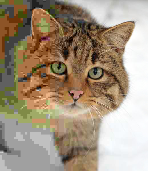
Image result for jpeg  (Look carefuly at the image and you will notice something different)
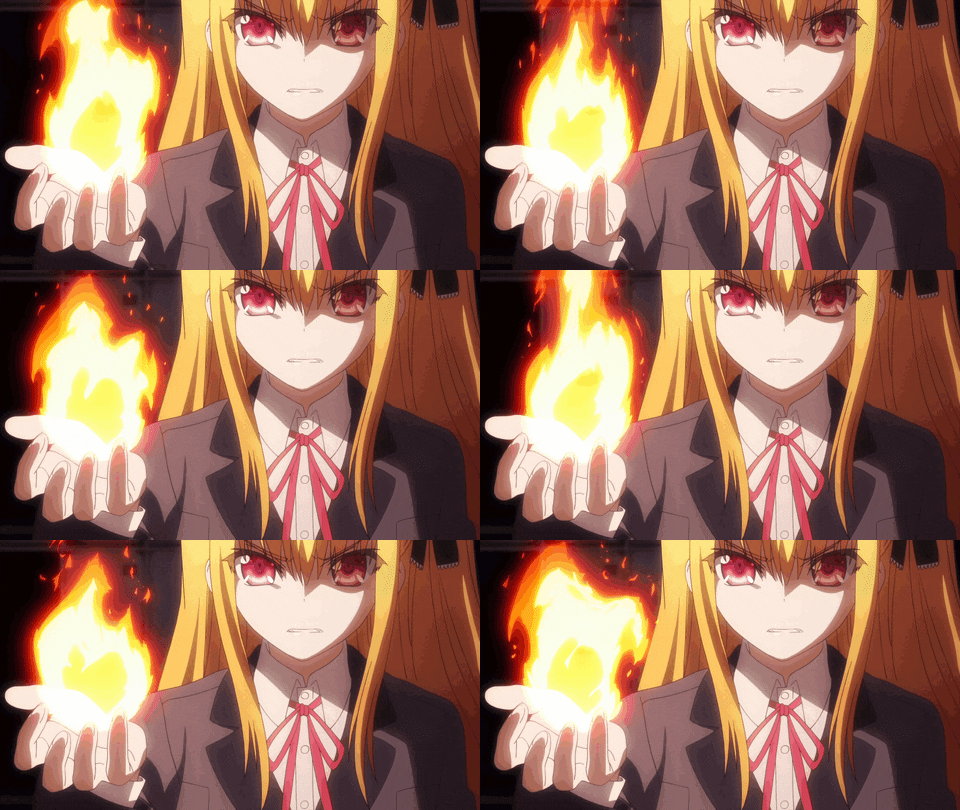
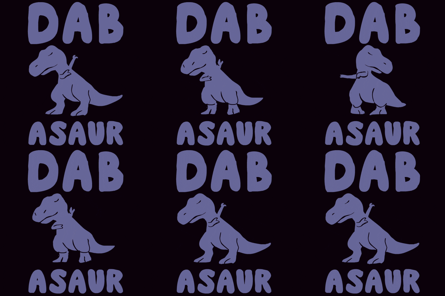

GIF: Stands for Graphic Interchange Format. Its a lossless format for image files that support both
animated and static images.
 Image result for anime gif Image result for gif

PNG: Stands for Portable Network Graphic. It is a raster graphic file formation that supports lossless Data compression. PNG was created as an improved replacement for (GIF) and it is the most use lossless image compression format on the internet.
Image result for png ( why is there nothing in the back ground)
RAW: This file doesn't stand for anything. Raw files makes the mage quality very good, smooth and detailed. Raw provides and unfiltered image of light, colore, darkness and shadows. Also raw files are much bigger then JPEG files because they hold much more details and the picture comes better then JPEG.
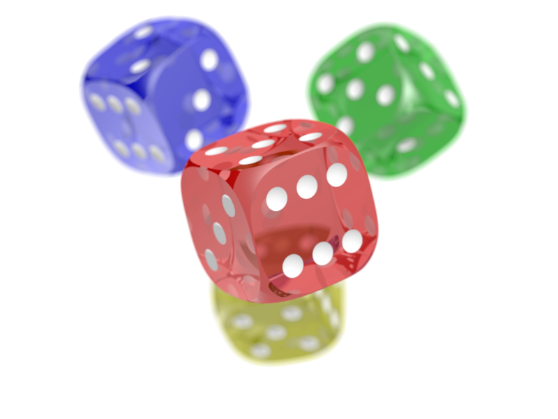
 Image result for raw in photography( Look at the clear difference between those pictures.)
Tiff: Stands for tag image file formation. Tiff is a common formation for exchanging raster graphic images between application programs. Including those used for scanner images. Tiff files are commonly used in Desktop publishing, Faxing, 3-D application and medical imaging application.
Image result for tiff photoImage result for tiff photo
Tiff is 3-D and its really cool.

Thursday, September 15, 2016

Windows VS Mac

Welcome to the showdown!!
Mac VS Windows
Windows and Mac are two of the most popular and best brands for electronic devices out there. But there are a lot of differences between them. I can say windows products are all around the world but mac is not because it coasts more then windows product. According to a pie chart made in 2016
you can see 91 percent of the people uses windows products because everyone is familiar with that. Also the price is really low so if one gets broken or doesn't function properly you can get a new one easily. Also i think its better use because like mac it have control keys to help work fast. This is all my opinion about windows and i might be wrong. Also we are going to learn about photo editing in MAC so ill get to know which one is better.

Some keys that really helps in windows is that you can put ctrl+c to copy, ctrl+v to paste ctrl+ w to close a page' ctrl+alt+del to see task manager or lock PC switch  users and many more with only 3 keys. Windows is amazing.

Wednesday, September 14, 2016

Who am I? Why am i here?

Hello everyone! I'm really happy to be in visual design with all of you wonderful people. I'm Md!

Many of you know me but if you have never met me in this class or school you will get to know me. 

My name is Md. Bhuiyan and my nickname is MD. Im a sophomore in ITHS. I am from Asia to be specific I'm from Bangladesh. I'm 15 years old. My birthday is in June and I live in Woodside . I have only one sibling. He is 6 years old. In my free time I like to listen to music and watch anime. I like comedy, action and horror anime and movies. And I sleep a lot. I mostly wake early in the morning which is really weird. Other kids sleeps late and wakes up late but even if i sleep late I have a specific time when I wake up. Also I am a really good watercolor painter. I also like painting but I cant do color painting at my home.because I make a big mess when i work. Also I hate to work with other people. If I do my work in a quite and alone place i do better then when i do it with people. And I don't get mad a lot but when I do I stay mad really long for that reason. I love eating fast food. I like Pizza the most between all of them. That's almost everything about me. 

There are many reasons why I'm here but the most important reasons are that I can get a per time job in college to help me earn money for my college payment and I want to be a web designer and to be a web designer I would need to learn how to make my website beautiful and attractive so people uses it. The second reason is that I like to travel and go to new places so if I finish my college and get a professional photographer job i can travel to many parts of the world and take picture. So people will see the beauty of the nature.

After finishing the 3 years of web designing course I would like to work on social media management department for google or other social medias. Also if I work for google, yahoo, facebook and many more and graphic arts will be a really big help for those kind of jobs. When new updates come it can get a better look and features may change. There are some of the best reason why I'm here. There are other reasons but those are the main once for me. Hope we will have a good 3 years of class together and along the way make new friends and make our class like a family rather then a class.